
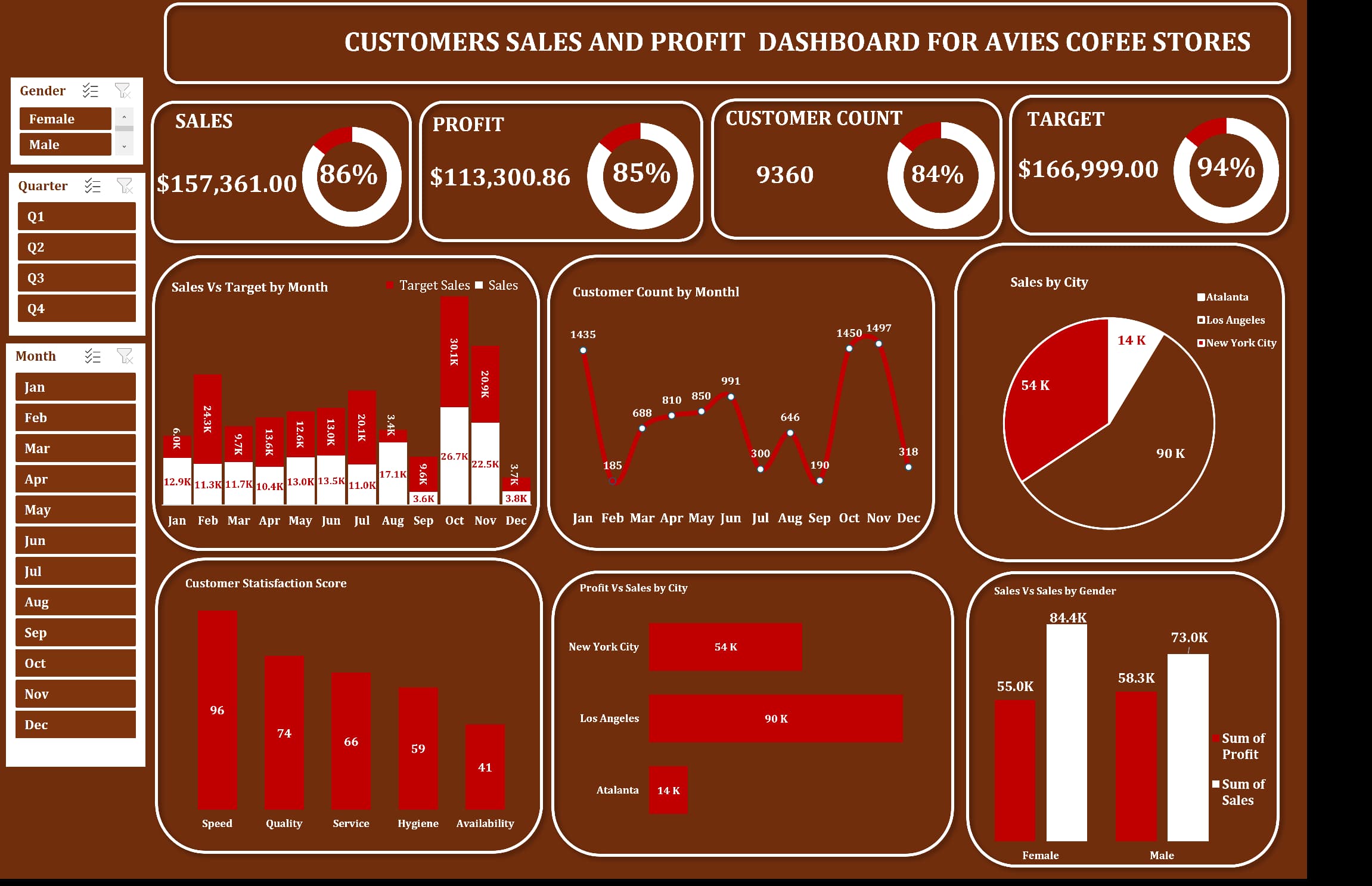
Customer Sales and Profit Dashboard for Avies Coffee Stores
Project related images. Click to view
Objective:
To design an interactive and insightful dashboard that enables data-driven decisions by visualizing key performance indicators (KPIs) such as sales, profit, customer count, target achievement, and customer satisfaction across various dimensions.
Tools Used: Microsoft Excel (Pivot Tables, Slicers, Charts, Conditional Formatting)
Overview:
This dashboard presents a complete picture of customer sales and profit performance across different cities, genders, and time periods. The interactive filters allow users to slice the data by Gender, Quarter, and Month, ensuring focused and customizable insights.
Key Insights & Features:
1. Top-Level Metrics:
Total Sales: $157,361
Total Profit: $113,300.86 (85% Profit Margin)
Customer Count: 9,360
Target Achievement: 94% of $166,999 target achieved
2. Time-Based Analysis:
Sales and target trends are visualized monthly, identifying high-performing periods like October and November, and underperforming months like July and December.
Customer count peaked in November (1,497), with sharp dips in months like August and December.
3. Geographical Performance:
Los Angeles led in both sales and profit with $90K, followed by New York City ($54K) and Atlanta ($14K).
A bar chart contrasts profit vs. sales across these cities, helping identify the most profitable markets.
4. Customer Demographics:
Gender-based analysis shows that female customers contributed more to sales ($84.4K) compared to males ($73K), though males generated slightly higher profit ($58.3K vs $55K).
5. Customer Satisfaction:
The scorecard highlights Speed as the most appreciated aspect (96), whereas Availability scored the lowest (41), suggesting a potential area for operational improvement.
Impact & Value:
This dashboard empowers stakeholders with a real-time, visual snapshot of business performance. It supports strategic planning by spotlighting trends, market strengths, and customer behavior. Moreover, it serves as a diagnostic tool to address underperforming areas, improve service quality, and boost customer satisfaction.
Reflection:
Creating this dashboard refined my skills in data visualization, Excel-based interactivity, and business analytics. It also reinforced the importance of clean layout design and contextual storytelling in data presentations.
Comment (0)
Other projects by Kayode
Talentdigit Resources Limited is a digital training and consulting firm that equips individuals and organizations with digital skills training.
Address: 4 Amurie omanze street (off star time junction) Garki 2, Abuja
For Inquiries Call: +234 (0) 7062274671


Leave your thought here