
OPay Inflow and Outflow Analysis Dashboard
Project related images. Click to view
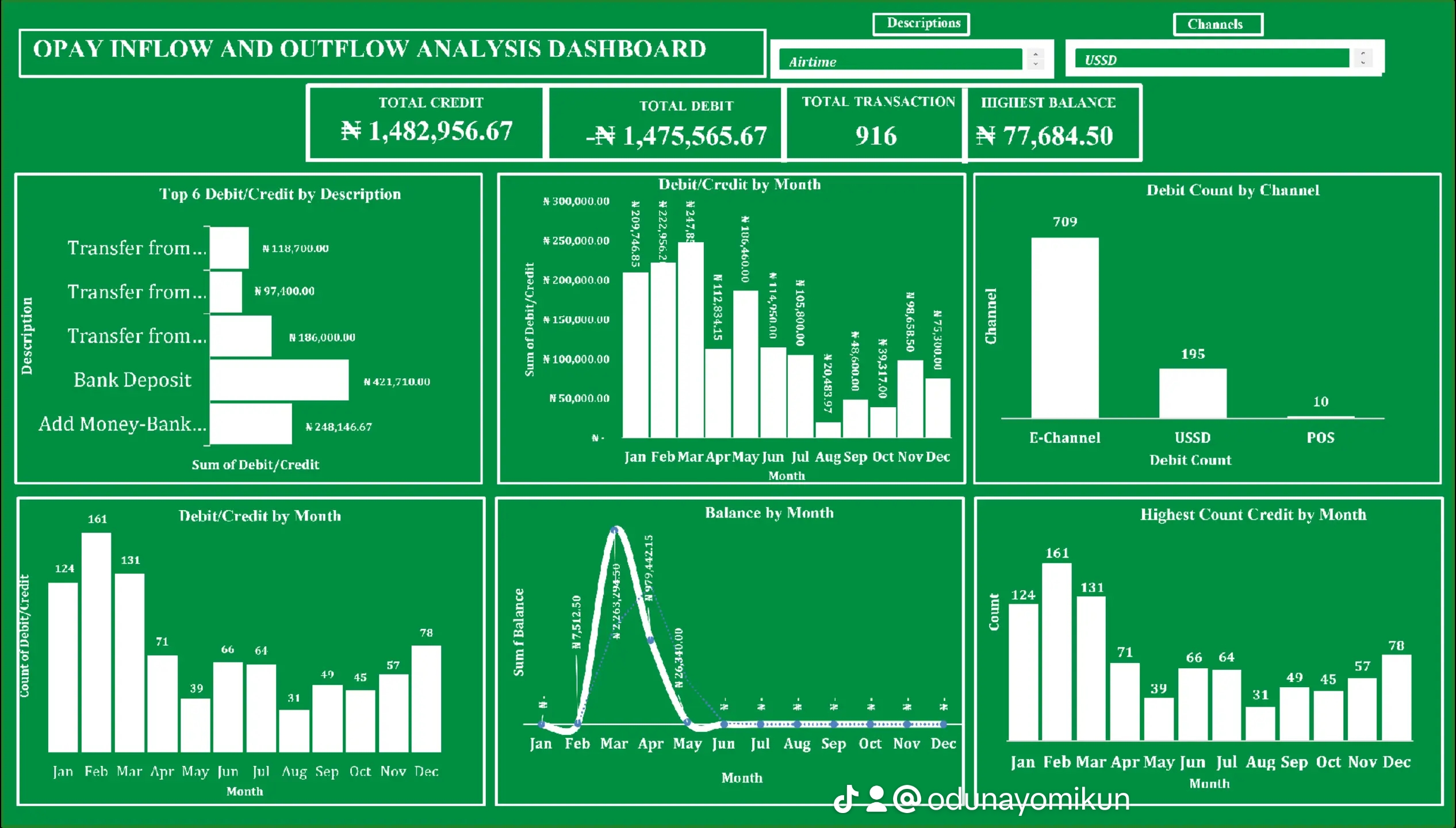
OPay Inflow and Outflow Analysis Dashboard
As part of my data analysis and dashboard design portfolio, I developed an OPay Inflow and Outflow Analysis Dashboard to visualize and monitor financial transactions effectively. This dashboard provides clear insights into account activities, helping stakeholders understand inflows, outflows, balances, and transaction patterns over time.
Key Features and Insights:
Total Financial Summary:
Total Credit: ?1,482,956.67
Total Debit: ?1,475,565.67
Net Balance: ?77,684.50
Total Transactions: 916
Top Transaction Descriptions:
The dashboard highlights the top 6 transaction types, revealing that the highest credit inflow came from bank deposits (?421,710.00), followed by "Add Money - Bank" (?248,146.67).
Monthly Transaction Trends:
March recorded the highest inflow/outflow volume, both in transaction count and monetary value, with ?282,293.45 credited and 161 transactions.
July and August showed the lowest transaction volumes, which may reflect seasonal or operational trends.
Channel Performance:
The majority of transactions (709 out of 916) were conducted via E-Channel, showing its dominance and preference among users.
USSD and POS followed with 195 and 10 transactions, respectively.
Balance Tracking:
The balance peaked in March (?242,415) and significantly dropped after April, indicating higher outflows or reduced inflows in the following months.
Usage Patterns:
A visual month-by-month breakdown shows transaction counts were highest in Q1, declining mid-year, and slightly rising again in December—potentially aligning with income cycles or seasonal spending.
Tools Used:
Microsoft Excel – for data cleaning, transformation, and visualization.
Power Query – to automate data preparation and manipulation.
Pivot Tables & Charts – for dynamic data summarization.
Excel Dashboard Design Techniques – for user-friendly layout and interactivity.
Slicers & Filters – for interactive drill-down and segmented analysis.
Skills Demonstrated:
Data Cleaning and Transformation
Financial and Transactional Analysis
Data Visualization and Reporting
Dashboard UI/UX Design
Insight Communication and Business Intelligent
This dashboard is a practical example of turning raw financial data into an interactive and insightful reporting tool that enhances decision-making. It demonstrates my capability in data storytelling, business intelligence design, and financial analysis.
Comment (0)
Other projects by Kayode
Talentdigit Resources Limited is a digital training and consulting firm that equips individuals and organizations with digital skills training.
Address: 4 Amurie omanze street (off star time junction) Garki 2, Abuja
For Inquiries Call: +234 (0) 7062274671


Leave your thought here